Learn From a Chef
LearnFromAChef.org was founded by Querida Qiu, an ex-chef at multiple Michelin-starred restaurants and a Stanford MBA. Classes were taught live by experienced chefs, in small groups no more than 10. Students could learn recipes & techniques from the masters, and have all of their questions answered in real time.
All proceeds went to the chefs.

Learn From a Chef
Clare Nguyen, Querida Qiu (Founder)
UX design intern
Competitive analysis, user research, surveying, interviewing, usability testing, prototyping, UI design, wireframing
April 2020 - May 2020
Background
Learn From a Chef was a non-profit organization whose mission was to help chefs who are impacted by COVID-19.
When I first joined Learn From a Chef, I had a meeting with Querida Qiu, the founder, to discuss the goals of her organization and what she was hoping to accomplish with my help. She explained to me that she was interested in learning more about her current users, who their target audience is, and how we could improve their platform to make the user experience better.
Results
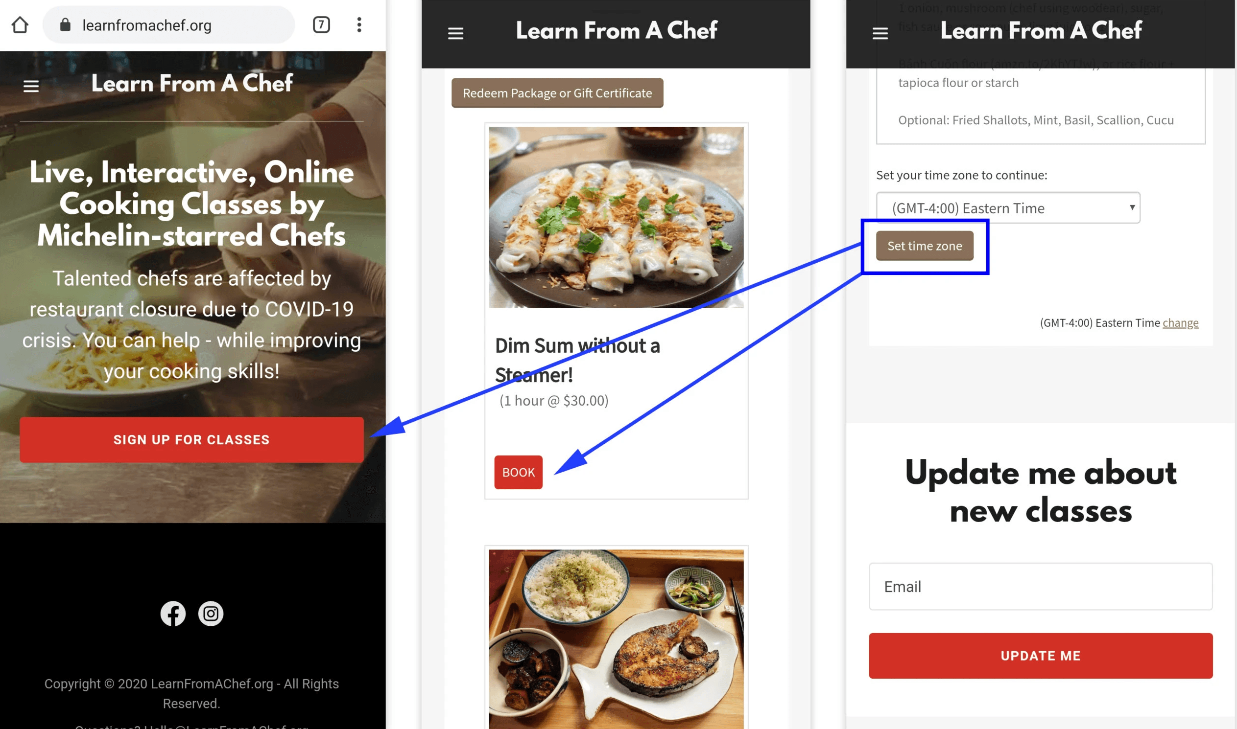
Changing the "Set your timezone" button to match the site's red and clearer button conventions dropped the bounce rate from 59.23% to 40.62%, which held steady for three weeks.
In the second usability test, all five participants completed every task, including finding ingredients and booking a class, with no issues.
The redesigned Classes page gave users what research showed they cared about most: feeling fully prepared, with ingredients, difficulty level, and class details surfaced up front.

Research
To understand the users and the current platform, I reviewed Google Analytics and Facebook Business data and broke users into two groups: potential users and current/past users. I crafted two separate surveys, but first I ran a usability test to find out why the bounce rate was so high.
First usability test
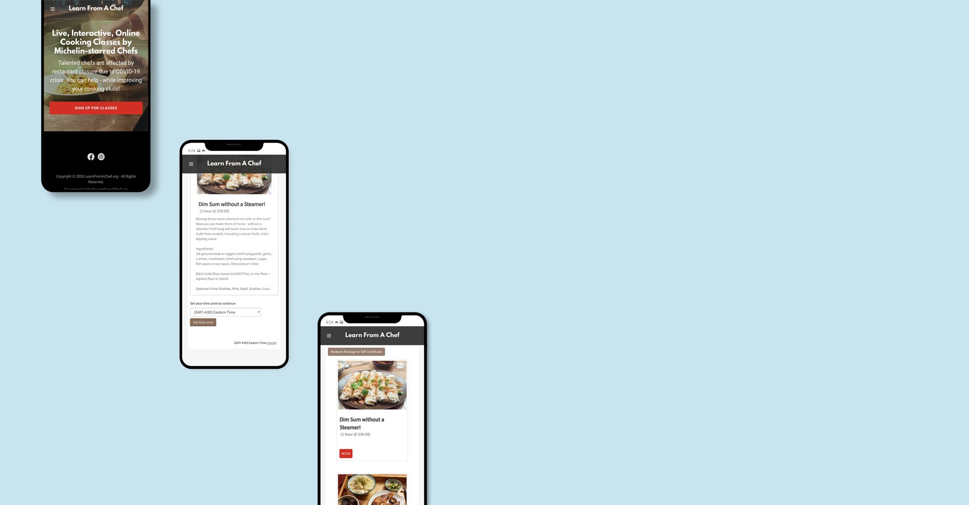
I asked five people to book a class, purchase a gift card, and read about the instructors on their phones. All five could find and select a class, but 3 out of 5 got stuck on the next step. They had skimmed over the "Set your timezone to continue" section because:
The correct time was already set automatically
They expected a red button (like the rest of the site), not a brown one
They expected the button to say "Next" or "Continue"
They thought the mobile site was broken! Because Learn From a Chef is such a small organization, we were able to change the button color right away, and the bounce rate dropped from 59.23% to 40.62%.

Analysis
I organized my survey and interview data into an Affinity Diagram, and it became clear that users fell into two categories: confident or doubtful. Despite their different feelings, both beginners and intermediate cooks cared most about feeling fully prepared. That meant a full ingredient list with exact measurements, explicit instructions before class, and easy access to the instructor. I created a persona to help keep our focus.
Design
I looked at competitors like Masterclass, Rouxbe, and Food Network, each of which offered something useful. Then I focused on the Classes page, which, along with the front page, was where people spent the most time.
Using a Crazy 8s exercise, I sketched variations that stayed close to the current site. With the bounce rate now hovering around 41%, I didn't want to give it a giant face lift. If there's something I've learned, it's that people adapt better to small, incremental changes! Based on my interviews, each class needed a title, photo, short description, cost, level of easiness, and tags.
From there, I storyboarded the flow from the front page to a successful sign-up, borrowing ideas I liked from other sites, like user reviews. In the prototype, I kept Learn From a Chef's distinct red, which had already been used in a lot of their marketing. The last thing I wanted was to cause any confusion!

User testing
I tested the prototype over Zoom with five new people who had never used Learn From a Chef. I asked them to find reviews, pick a class and name its ingredients, book it, and read about the instructors. I always hold my breath during usability tests, but thankfully every user completed every task with no issues whatsoever. They knew exactly where to go next.
Conclusion
All in all, joining the Learn From a Chef one-woman show as a UX designer was an excellent learning experience. Since Learn From a Chef is such a small organization, we were able to implement my recommendations as I would update Querida. Seeing my advice pull in immediate positive results was phenomenal.
If you can recall, at the beginning of this case study, I discussed the bounce rate for Learn From a Chef. The bounce rate was 59.23% – higher than average! After we rolled out the update where we changed the color of the button to match the rest of the site, the bounce rate dropped down to 40.62% – which is considered Excellent!
This bounce rate has stayed consistent over the past 3 weeks. Amazing what a little change like the color of a button can do, huh?